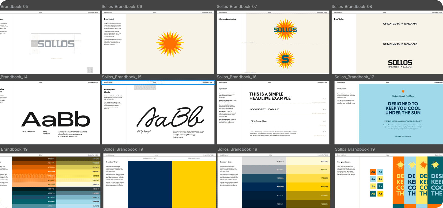
We don’t have a house style.
That might be making our job harder.
By Palu, Founder & Creative Director ·
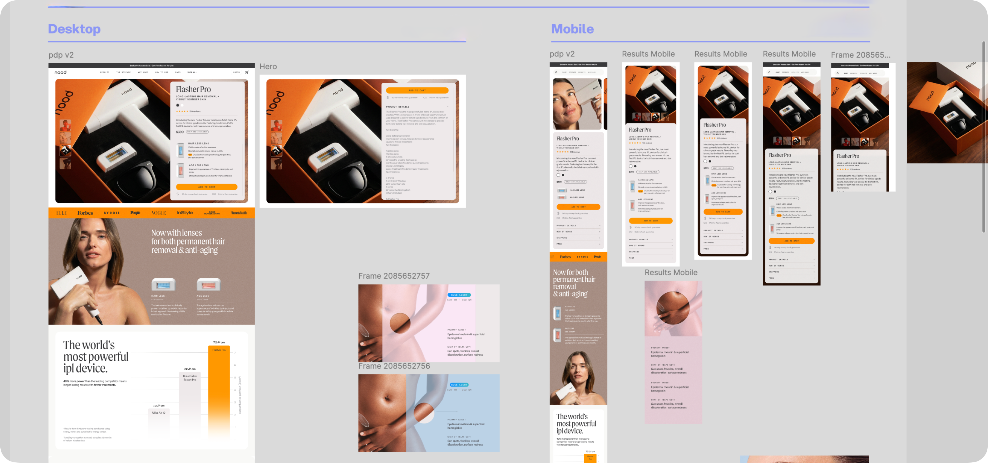
If you scroll through a lot of agency portfolios, you can feel a thread. A visual language that runs through everything. You might not be able to name it, but you recognize it. The colors lean a certain way. The typography has a vibe. The photography direction feels familiar across projects. That’s a house style, and a lot of great studios have one. We don’t.
At CreativeWise, we’ve always taken pride in that. Every project starts from zero. The brand’s goals, the audience, the category, the competitive landscape. All of that determines the direction. Not our preferences. Not a visual signature we carry from project to project.
To be honest, I was thinking about this today and I’m not sure we’re not making our own lives harder by working this way. Here’s what I mean.
When an agency has a recognizable style, clients come to them because they already love that style. The expectation is set before the first call. The client has seen the work, they want something in that world, and the starting point is already half-defined. The mood boards are tighter. The feedback rounds are shorter. Everyone is working from a shared visual vocabulary from day one.
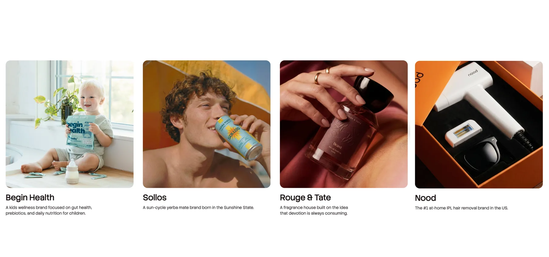
For us, the drawing board is a blank page. There is no starting point beyond references. Our mood boards tend to go in a lot of directions early on because we’re not defaulting to a house look. We’re building the visual language from scratch every single time. And that takes more exploration, more back-and-forth, more rounds to really capture what the client sees in their head.
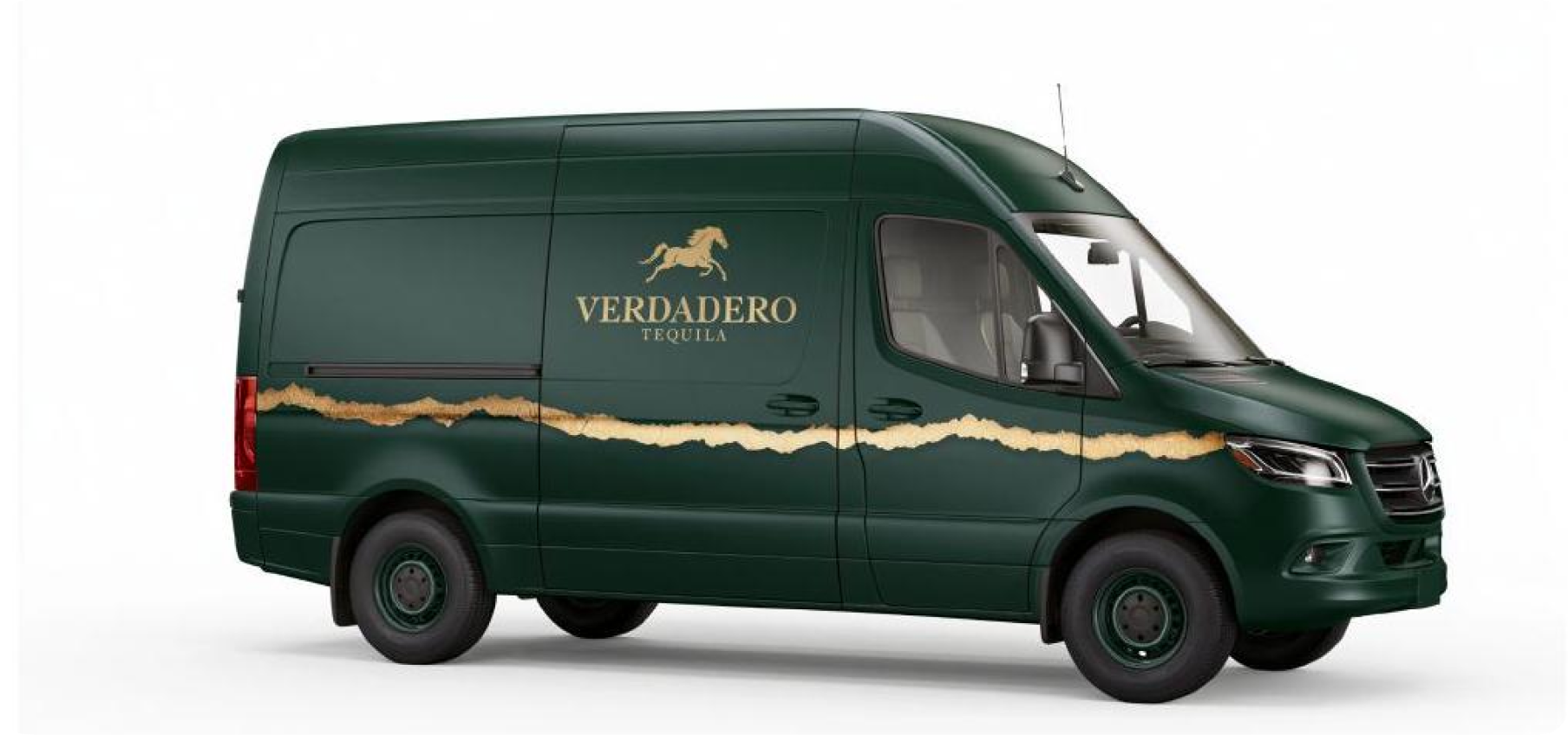
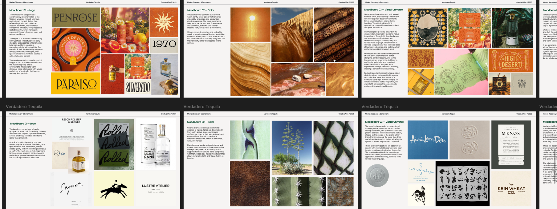
With Verdadero Tequila we went through three full mood board rounds before we even touched the logo. Each one had separate sections for color, typography, visual universe, events, photography. That depth was necessary because there was no template to fall back on. We were finding the brand’s visual identity together, not applying ours to their business.
So yeah, it’s harder. I’m not going to deny it isn’t.
But the alternative doesn’t sit right with me either. When a studio has a strong house style, the work is cohesive and recognizable, but it’s the studio’s aesthetic, not the brand’s. If you line up five of their clients, they kinda look like siblings. That works for some brands. For a CPG brand that needs to own its shelf, its website, its campaigns, I think the visual language has to come from the brand itself. Not from whoever designed it.
Our team is built for this. Carla, Agus, Joy, Vic, Kalu, Jus, each of them has aesthetic preferences, styles they naturally thrive in. We try to match projects to the right person whenever it makes sense. But the reality is that when you work with a team of all senior designers, you can throw anything at them and they’ll always exceed expectations.
It’s slower at the start. It takes more mood board rounds. It takes more internal exploration before we land on something. But what comes out the other side belongs entirely to the client. Not to us.
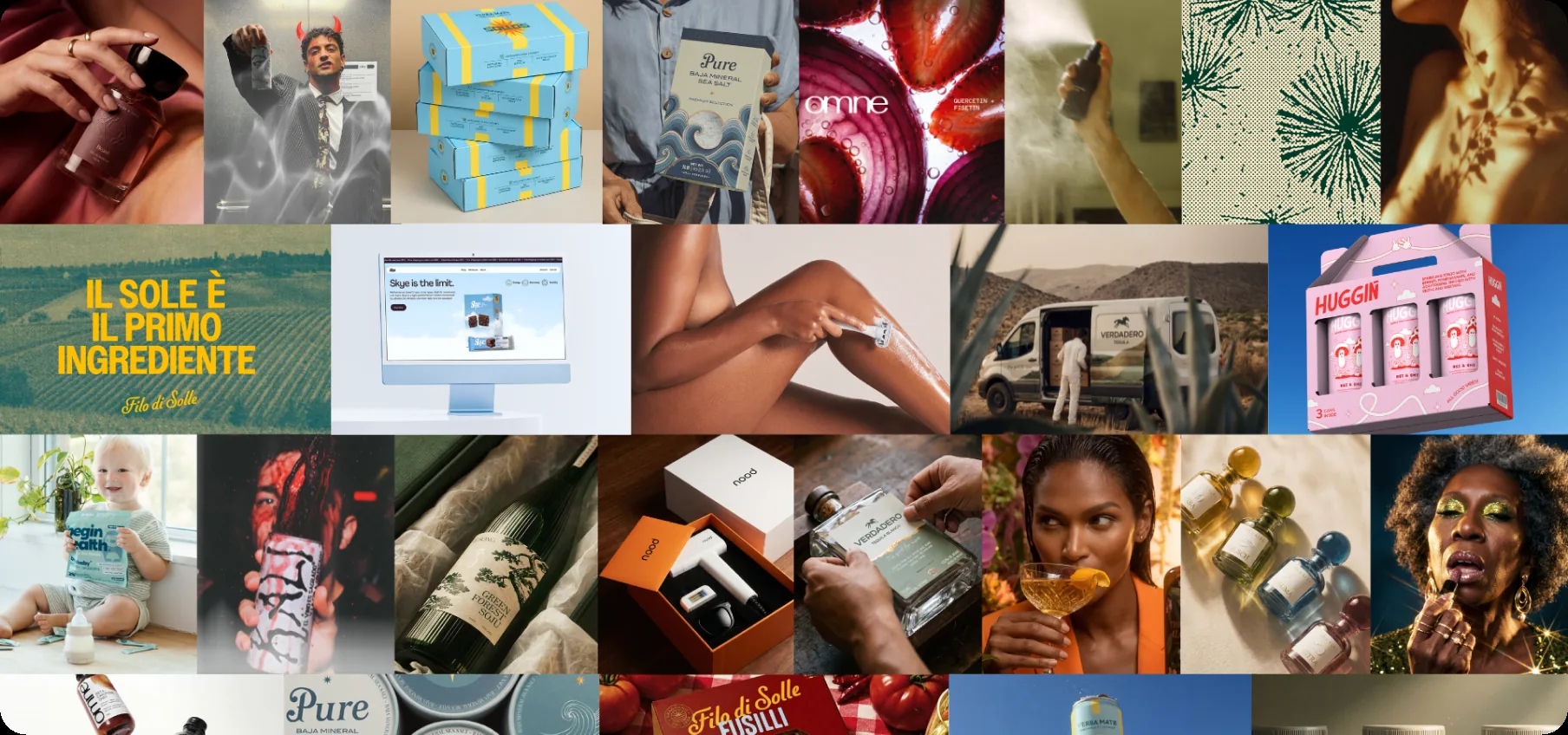
I don’t think one approach is better than the other. I just think it’s worth being honest about the trade-off. A house style makes the process faster, the portfolio more cohesive, and the whole operation easier to scale because the formula is already there. No house style makes the process harder and the output more varied. We might have chosen the least straightforward path, but we’d probably choose it again.
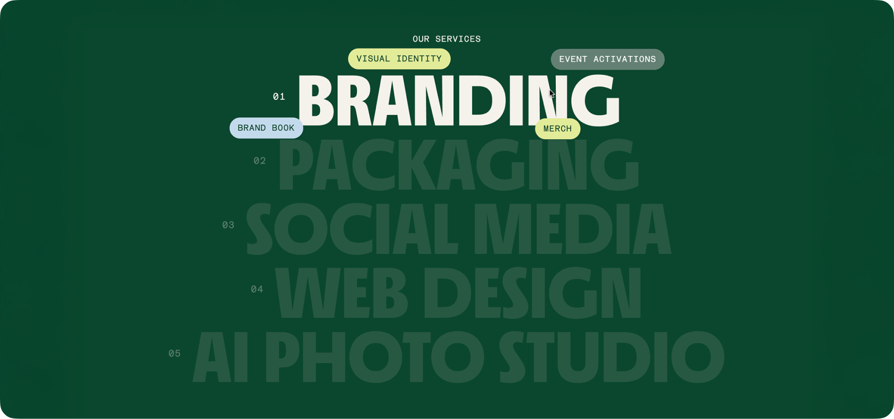
CreativeWise is a design studio for consumer brands. Every project starts from scratch. No house style, no visual template. Just the brand’s goals and a blank page.