Beautiful does not mean it sells.
By Ali Nadal, Brand & Growth Strategist ·
Over the last few months we have worked with a wave of conversion-focused CPG clients. The kind who measure everything, and who care about one number above all: how many visitors actually buy. We learned a lot in the process, and it felt like time to write some of it down.
The lesson that surprised people most is the one in the title. A beautiful website does not sell. That is a strange thing to admit as a design studio. But a gorgeous site that makes people work to understand it loses money, quietly, every day. We have watched it happen to brands we love.
Beautiful is not the same as effective.
Sometimes you give up a little beauty to make a page convert. Not all of it. The goal is still both. But when the pretty version and the version that sells pull in opposite directions, the one that sells has to win. Your job is to know which one bends, and when.
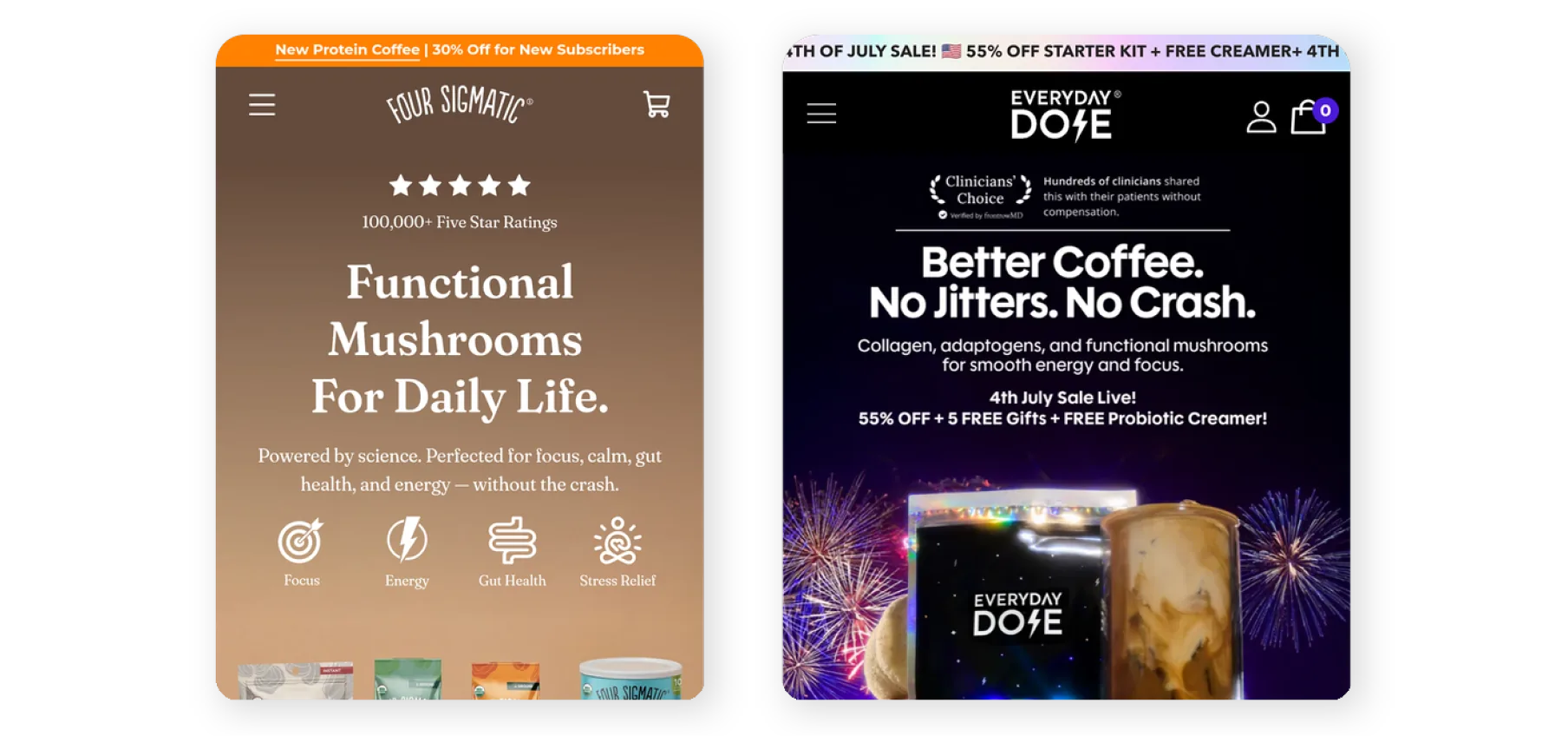
The brands doing this well are not subtle about it. On Four Sigmatic, the first thing you see is the product, a hundred thousand five-star ratings, the price, and the button. Four answers in one screen: what is this, can I trust it, what does it cost, how do I buy it. Everyday Dose does the same on its product page. Title and reviews up top, subscribe and save framed as the default, trust icons sitting right under the button, and a straight path to checkout with no detour. Nothing left to figure out.
The product page is a conversation.
The lesson that landed hardest was about product photos. We treat them like a gallery. They should be a conversation. Seven images, each one answering the next question a buyer is already asking, in order. What is this. What do I get. Can I trust it. What will it do for me. Do other people use it. Will I like it. Should I buy now. Most brands shoot the first two and stop, right when the real selling begins.
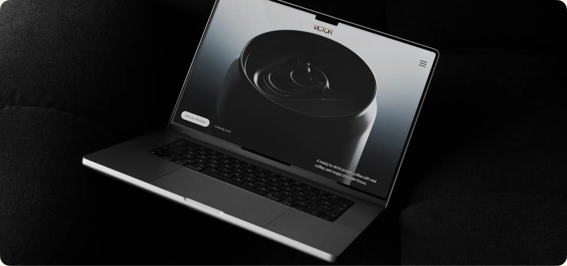
And the principle I keep coming back to: the goal decides the design. We showed three of our own builds and they could not be more different. Skye is built to sell, with the full product-page machinery. Verdadero, a tequila, does not sell online at all, so the site exists to make you want the bottle and go find it in a bar. Victor, before it launched, was a single page with one job, collecting emails from the people who wanted in early. Same studio. Three completely different questions. Anyone building the same site for all three is guessing.
We pulled the full breakdown into one presentation. You can go through it here. There is one piece I did not get into, the one that really changes the math for food and consumables: how to set up subscribe and bundle options so they actually make you money. I will write that one next.